These are screenshots of what we did in class together with the Professor. With this constructed we're now allowed to wander off on our own and get creative with the font for this current Bibliography, showing hierarchy through the use of size, italics, bolding, etc. to style the sheet.
Below is the updated version of the Bibliography from class using the Vollkorn typeface found on Google Web Fonts. It's another Serif, like Georgia.
I don't know if she wanted us to just do the body copy in another typeface or the entire thing, but my guess is she wanted the entire thing done in an entirely new typeface. Next time I'll have to remember to ask off the bat.
Our homework to go along with the in-class work was to construct our own Bibliography according to the guides she gave us in our digital PDF hand-out. It's all in regards to typography, with our sub-headings being that of Motion/Kinetic Typography, Vintage Typography and Hand Drawn Typography. Interestingly enough, each time I look for a book in regards to one of these I keep coming up with many hits that have Steven Heller as an author or editor.
I take this as a sign I should probably look up Steven Heller and see who this particular individual is if he has his name on so many books in regard to typography. The only category I didn't find him in was the Motion/Kinetic Typography search, which was admittedly hard looking for books on it as they weren't books by themselves, but most were only portions of a larger overall book.
Would those count towards it?
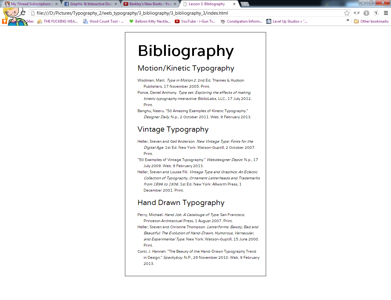
These are screenshots of the bibliography done for homework. I managed to find at least 2 books on each subject, and perused design blogs for the articles linked below. Most had authors, although one did not but I think that the particular article used pre-dated the addition of contributors to the site.
I looked through a few different fonts in regards to this particular piece, but ended up settling on Varela. It looked best both as body copy and as headings. Some of the fonts only looked good as body copy, and when it came to the headings they fell pretty flat.
Here's screenshots of what the fonts I cycled through before settling on Varela look like:
I'm not entirely sure as to which screenshots we're supposed to be comparing and contrasting for this exercise, but I guess I'll touch on the two done outside of class and not the one done in class. In other words, my example using Vollkorn and Varela.
First off, I did not intentionally choose V-named fonts. That was an accident, lol.
Now onto the actual fonts themselves...
Aside from these two fonts being of different types (serif versus sans serif)


No comments:
Post a Comment