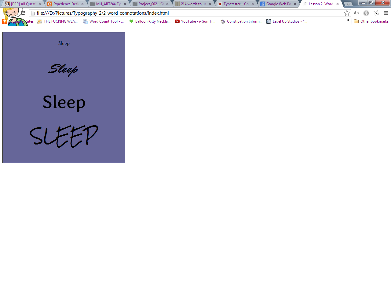
Basically, for this project we're translating the usage of fonts into meaning to our words. A word is just a word, and a typeface can be just a typeface, but when you match the two together you give the word meaning as its read by the viewer. If I'm trying to be serious about something, I'm not going to use the Comic Sans typeface to express that. I'll use something a little more traditional looking or professional.
We were to pick a word and using 4 different web-safe typefaces, as well as manipulating the aspects of those typefaces with things like italics, size, etc. in order to convey meaning to the word and help with its connotation.
I decided to use the word 'sleep' as its what I've wanted to be doing for the last two days or so. Sleep on its own is harmless, but paired with the right font it can be frightening, or alluring, a simple command, or a gentle prod. I tried to capture those sorts of essences with my word.
We apparently went over HTML and CSS briefly in class, but since I had those in Digital Theory & Skill I ended up going through the majority of the project fairly easily. I will admit I totally forgot to start the HTML tag at the top of my index and spent the better part of 20 minutes wondering what I did wrong and contemplating chucking my monitor out the window, Lol.
All my typefaces were collected from Google's web-safe database of typefaces and they were chosen primarily on the basis of handwriting and serif.
Here are screenshots of the various typefaces I used trying to find what described sleep best to me.
And then these two screenshots are of my final piece.


No comments:
Post a Comment